.png)


What is the Pipeline Performance Dashboard
The Pipeline Performance Dashboard is a key tool to analyze, measure, and optimize how leads progress through your sales process.
With clear metrics, customizable filters, and interactive visualizations, you gain a complete view to identify bottlenecks and increase conversions.
Why measuring your Pipelines' performance is essential
A Pipeline is not just a chart in your CRM. It’s the map of how your team works and where business opportunities are lost.
Measuring it allows you to:
-
Understand which stages are slowing down your sales.
-
Calculate the actual conversion rate.
-
Know how many leads require human intervention.
-
Improve the effectiveness of your sales follow-up.
👉 When you have reliable data, you can make faster and more accurate decisions.
Where to find the Pipeline Performance Dashboard
You'll find it in the Reports section of the Darwin AI platform. Just go to the Pipelines tab to view information about your leads, conversions, and follow-ups.
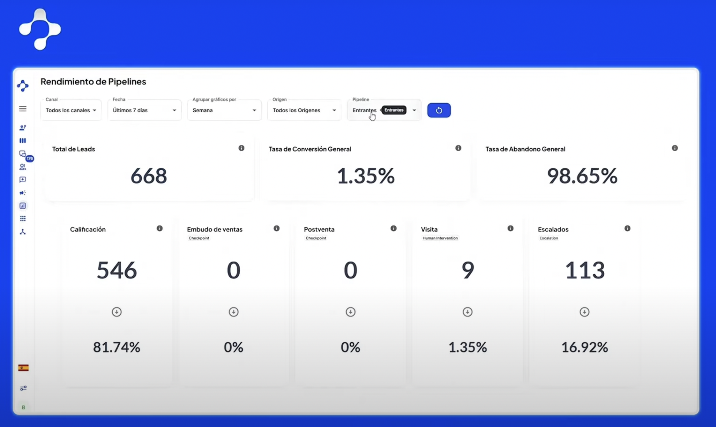
Main features of the dashboard
1. Intuitive filters
Use the same filters as other reports, making navigation simple and familiar.
2. Total Leads
Shows how many leads entered each Pipeline, always segmented by organizational unit.
3. Overall Conversion Rate
Indicates the percentage of leads that reached the final stage of the Pipeline or required human intervention.
-
If there are intervention stages, it’s calculated based on them.
-
If not, the last non-escalated stage is used.
The abandonment rate complements this, showing leads that did not reach the final stage.
4. Stage-by-stage percentages
Each stage reflects what percentage of total leads it represents, helping you identify bottlenecks and improvement areas.
5. Clear visualizations
-
-
Tables: Details of conversions and abandonments.
-
Bar charts: Lead distribution by stage.
-
Follow-ups and recovered leads: Comparative analysis of sales effectiveness.
-
Benefits of using the Pipeline Performance Dashboard
-
Full control over each Pipeline.
-
Clear and reliable metrics, automatically calculated.
-
Visualizations that make data easy to interpret.
-
Quick identification of improvement opportunities for your team
Recommendations to get the most out of it
-
Explore each section to get familiar with the metrics.
-
Compare different Pipelines and find patterns of success.
-
Adjust or customize if you need additional metrics—with the help of support.
Conclusion
The Pipeline Performance Dashboard is much more than just a report. It’s the tool that gives you clarity, control, and strategy to optimize your sales processes and convert more leads into customers.
When you measure, you improve. And when you improve with clear data, your conversion rate grows.